The Problem
New York’s restaurant and bar listings helped establish our identity online and were considered a great resource by our local readership. But with recent advances in Google search and the saturation of the market, there’d been a steady decline in consumer engagement. In August of 2012, there were 1.6 million visits per month to listings. By 2018, that number had dropped to 250k.
Led by the magazine’s Editor in Chief, the business decided to give our listings a reboot. Considering where our users came from, the plan of attack included an improved search experience, a new stand-alone listing page design, and an updated section front for our food content.
Team & Responsibilities
I worked with another product designer, a product manager, and several engineers throughout the process. My institutional knowledge of the product meant I was often the point person for stakeholder check-ins. We held daily standups and met weekly with the CCO for feedback.
I gathered competitive research and provided recommendations for the stand-alone listing page, but my primary focus was on the search experience.
Research & Insights
Looking at previously collected user interviews and current engagement metrics, it was clear the differentiator of our listing product was our expertise. People trusted the recommendations of our food critics.
This was in line with editorial’s opinion as well, as they were tired of maintaining thousands of listings when there was only small group with any real editorial perspective.
“NYC listings shows the most consensus for why people use nymag.com.”
First and foremost, don’t make anything worse. With such poor numbers already, it was essential that getting rid of so many listings didn’t affect our SEO equity and therefore our company revenue.
Upgrade the underlying tech. Modernize the platform by moving the tool into our latest CMS and incorporating Elastic Swiftype to handle data storage and output.
Go where our users are. With over 70% of site traffic coming from mobile, we need a mobile-first design approach.
Emphasize that we are knowledgable about New York’s food and bar scene. Features such as autocomplete and trending show we know what what the user is looking for even if she doesn’t.
Always provide clarity. Our categorization of filters must be user friendly and the UI should help illustrate why certain filters narrow and others expand results.
Saw unnecessary friction between searching and seeing results. Try to avoid additional slideout, but nice to see some of the filter.
Which filters should increase results and which should limit?
Display all selected filters for maximum clarity.
Some kind of rating system is helpful to emphasize authority.
How to distinguish between restaurants and bars?
What will a null state look like?
Flexibility for seasonality would be nice.
Design Explorations
I began my mapping out user tasks when searching.
Since free text was more straightforward, I focused on the filtering interactions. Specifically, I was working through the pros and cons of switching back and forth or keeping everything in a single page. My priority was to avoid any confusion over filter selection and simplify the path back to the results.
After much exploration, I landed on an interface with minimal disruption between selecting a filter and updating the list of results.
As the layout and structure of the search experience was coming together, it felt like the perfect time to build out a simple prototype in InVision to share with users for feedback. With limited company resources for user testing, we went around the office with a list of survey questions and spoke to five coworkers about the design. We were able to validate that users understood our grouping types and filtered by neighborhood and cuisine first. Pain points included confusion over scrollability of filters and results list. Lastly, users requested more restaurant info be displayed within the autocomplete dropdown.
Wireframes and More Prototyping
Taking into consideration the feedback I’d received from user interviews, along with general refinement and my continued iteration of the more complex elements - handling nested filters, displaying selected filters, and fitting in trending search terms - I had a solid mobile flow and wireframe to.
Finally, it was time to address desktop …
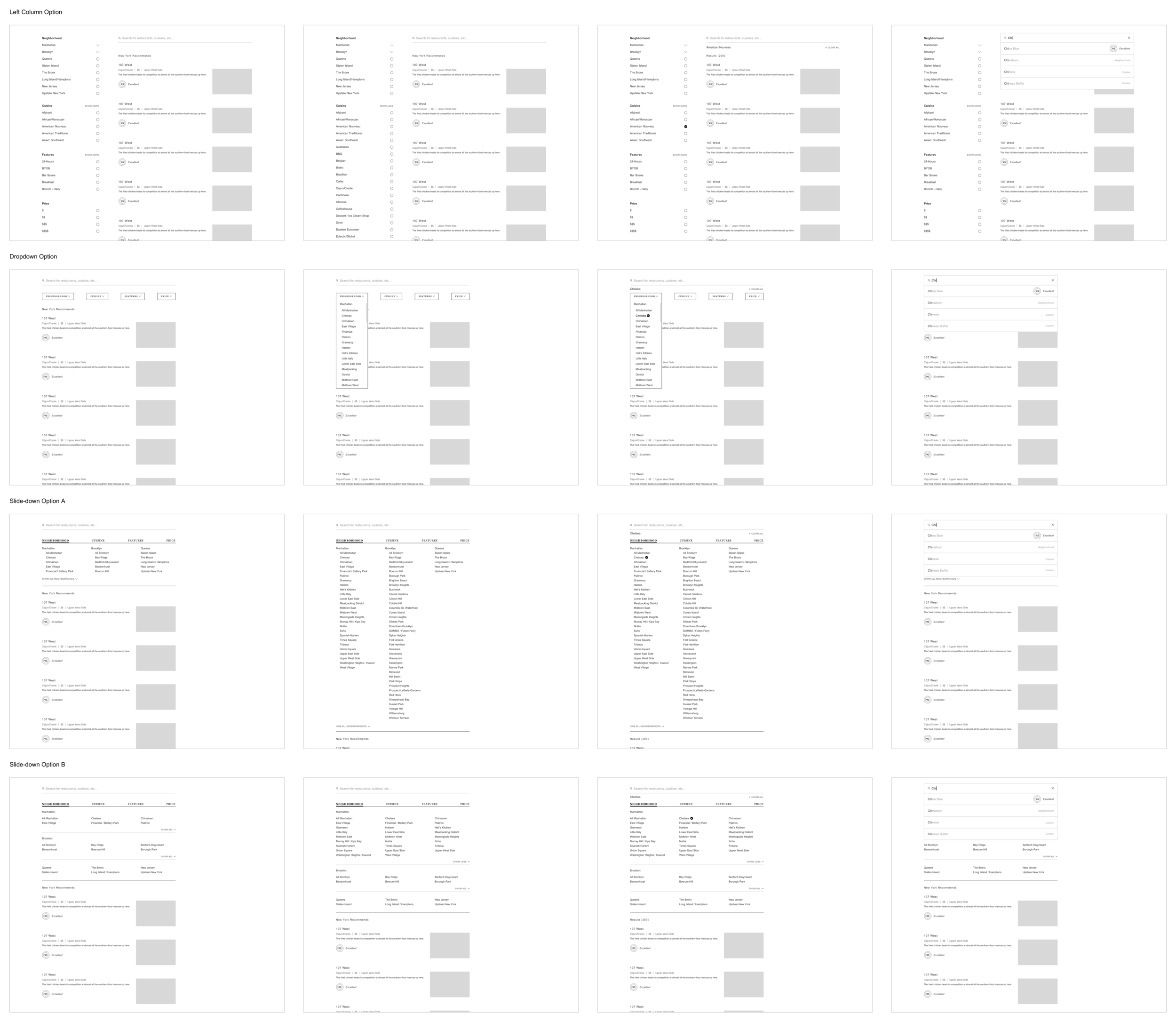
If I could change anything about my design process for this project, it’s that I considered desktop at an earlier stage. I felt that to accomplish the same seamless transition between search and results, we should organize our filters along the left side rail of the page. With more width to play with we didn’t need to stack everything like we did on mobile to emphasize the updating of results each time a filter was applied.
The company, however, has a long standing ethos that mobile should flow completely fluidly into desktop and vice versa. While I normally agree with this position - and understand the development lift of managing two distinct sets of code - in this particular situation I don’t believe it provided the best user experience. Our looming deadline didn’t help the situation either, so when the Head of Product and CCO pushed to move forward with and interface that matched the mobile experience, I didn’t feel there was much I could do. Looking back, I should have insisted on more time for iteration and the opportunity for another round of user testing - steps I will definitely be taking in the future.
https://nymag.invisionapp.com/share/AYNYZ8DFKDG
https://nymag.invisionapp.com/share/USNYZ6PRTM9
Adding Visuals
The main goal with the visual design was to imbue the flavor of the New York brand without negatively effecting the functionality.
The Outcome
Since launching, we’ve seen 27x more unique searches and a 41% increase in overall users month over month. While the number of listing pages decreased by about 86%, our user traffic only went down 7%. Lastly, Google referrals are up by 5% month over month.


