
In order to continue expanding the revenue stream from our Content Management System, Clay, the company wanted to invest in an integrated digital asset manager. Leading the design strategy, I identified user tasks, discussed the appropriate technical approach with our engineering team, and designed a UI that works within the existing platform's system.
The Team
I was the Lead Product Designer on the project, working directly with a Product Manager and several Engineers, the majority of which were remote. During a staff changeover, I also took on the role of product and helped onboard a new Product Manager and Engineer. I collaborated with our external clients as well as New York's editorial Photo Team to ensure the tool met all needs.
Context & Goals
Since its launch in 2015, New York’s Content Management System has become an independently viable product used by multiple media companies. Clients had expressed interest in an integrated tool for handling images published to their sites. One in particular, The City, had no image publishing tool whatsoever.
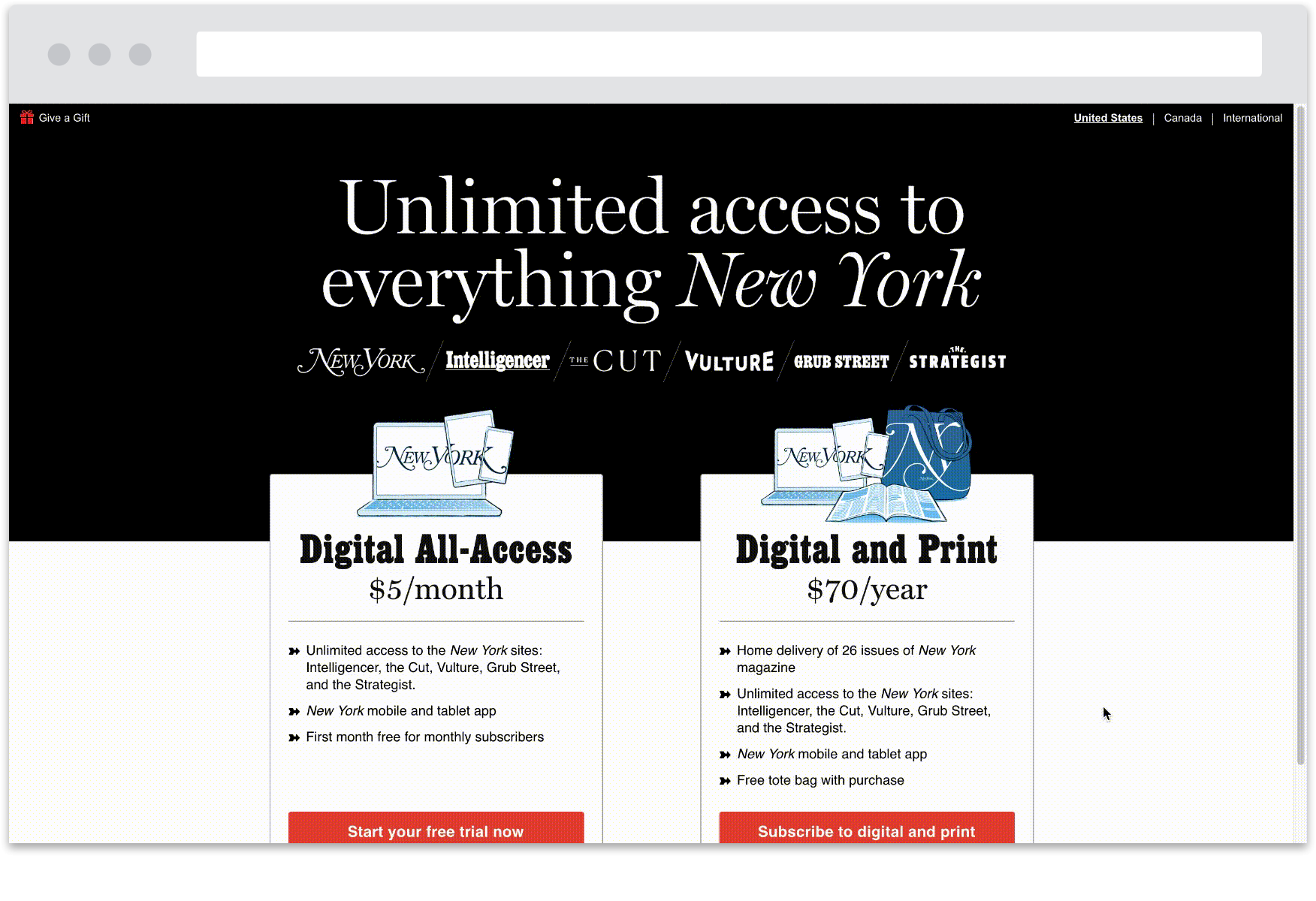
A Clay plugin for uploading, editing, and browsing digital assets (images, videos, GIFs, etc) would expand our publishing toolkit, bringing in additional clients and in turn increasing revenue. Additionally, our own employees would benefit from working with a more efficient tool. Our marketing team decided on Pyxis for its name, and, like Clay, it would be built with Google Material Design.
Research & Insights
Since our client, The City, didn’t have any digital asset manager, their needs were the immediate concern. After speaking with them, I put together a list of user tasks that defined our MVP.
MVP Requirements - User has varying levels of experience and basic editing needs:
Upload one or more assets via drag and drop or computer directory
Associate metadata with one or more assets on and/or after upload
Search previously uploaded assets using free-text and/or filters (date, asset type, content tag)
Single and bulk edit functionality
Remove an asset from the UI (archive)
Then I met with our Deputy Photo Editor to discuss how the MVP would need to scale into a more complex tool, since our photo team manages a high volume of assets that are displayed in several contexts across our digital platforms.
Post MVP Requirements - User has high competency and complex editing needs:
Define an asset’s focal area
Override the crop of an individual rendition
Replace an individual rendition with a new asset
We also did an audit of our existing internal tool. The purpose of this was twofold - understand the functionality so my design would have parity, and identify pain points to come up with better solutions.
Design & Testing
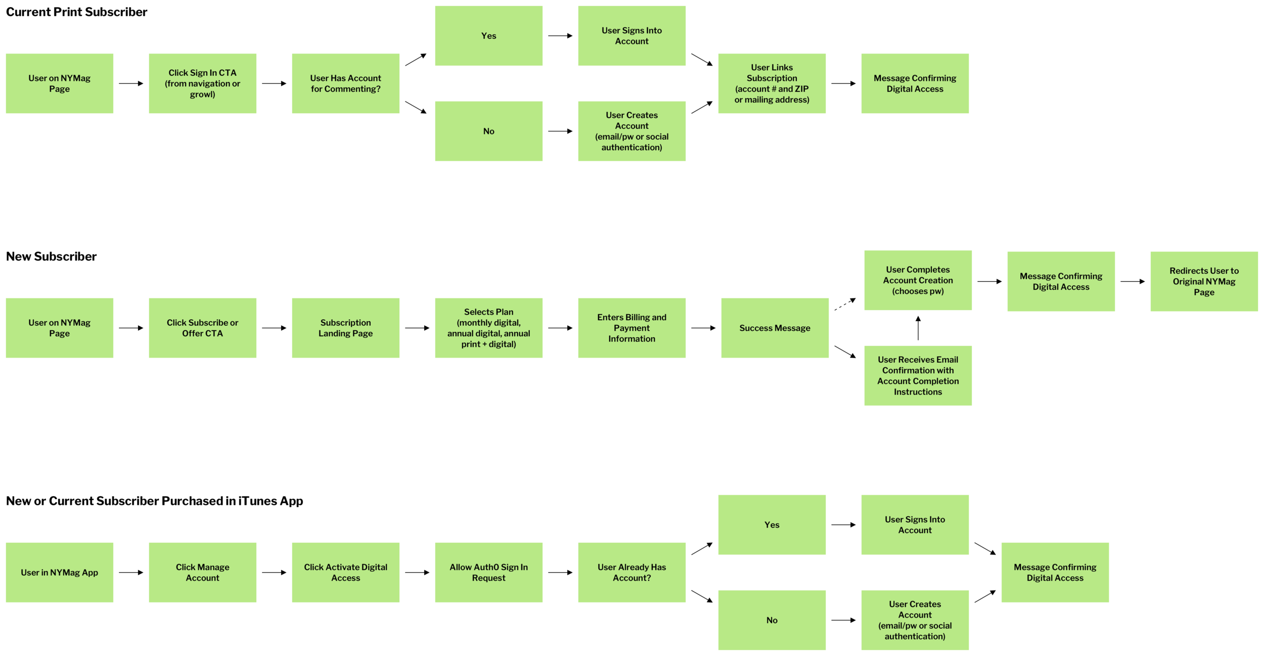
Before I began wireframing, I wanted to map out task flows for new and current subscribers. Since we were combining existing platforms with new ones, our users had multiple entry points into our digital subscription product and varying steps to take before they could access our digital content. Mapping them out helped me wrap my head around the complete experience.
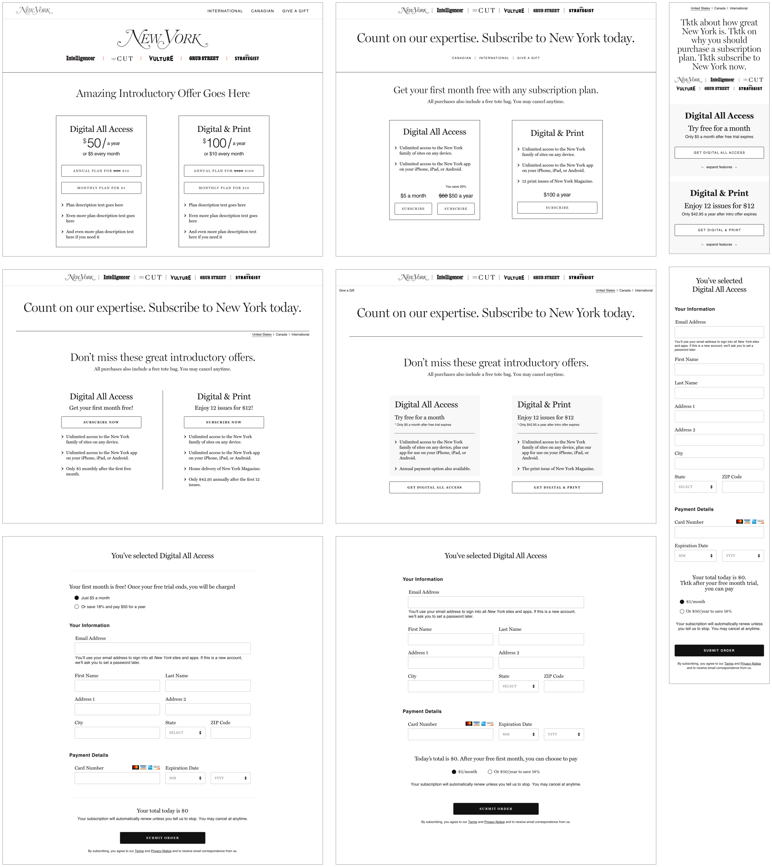
I then started sketching out the new subscription landing page. My focus wasn’t on overhauling the layout but instead finding areas that could benefit from optimization for increased click through rates and conversion. As I mentioned above, account setup integration and collapsable details on mobile were some of the areas where I saw opportunity.

Through discussions with other design teams and feedback from stakeholders, I decided to rethink the single page approach. My goal was to avoid a tedious multi-step process, but I also wanted to make sure every stage of the flow was straightforward. My solution was to hide the form until a plan is selected and then move the user down the page automatically. Each step is singled out but there are fewer opportunities to leave without purchasing.
At the same time I was working on the structure of the account management experience. For launch the page would display minimal information, but it needed to scale easily since it would eventually include additional preferences and memberships. I explored whether to include a menu (something my Product Manager was pushing for) even though it wasn’t really necessary yet.


Once the flows and architecture were in place, I worked with the Marketing Designer to add visuals and give the pages some character. It was important that things like color, typography, and navigation were consistent across pages to create a wholistic user experience. In addition, the consumer marketing team provided guidance for tone of voice on the landing page and we worked together to determine the best way to display the right message.
The Outcome
Due to the short timeframe and unforeseen technical issues, certain functionalities that I had incorporated into my designs ended up being impossible to build for launch. We were unable to integrate the account creation process into the purchase flow, provide account editing abilities, or build in additional mobile-specific functionality. Despite my frustrations, I understood that the company had committed to a launch date and put my energy into making sure improvements were released as soon as possible.
New Subscriber Purchase Flow


Existing Subscriber Flow


Post Launch Improvements
Immediately after launching, data confirmed the concerns about potential for confusion over the log in and sign up experience. We were seeing a trend of duplicate accounts and it was the primary issue addressed in customer support tickets. The company also noticed lower than expected mobile conversion rates. We updated the subscription product with many of the functionalities I had included in my MVP designs, as well as a simplified mobile experience with Apple Pay capabilities.
Updated Purchase Flow


Mobile Optimizations


Updated Account Management

I am very pleased that all of these improvements have significantly lowered the number of customer support tickets received, bumped up our conversion rates, and simplified the subscription process so that our users can easily access all the digital content we create for them! My team and I continue to refine and expand the product, and next up we will be building our own log in / sign up experience and running A/B tests on the landing page visuals and language to inform how we can further optimize it.